
/ Riverford Organic Dairy
/ Riverford Organic Dairy
Strategy, Brand Identity, Packaging


At the time of introduction, Riverford Organic Dairy was gaining a reputation for high-quality artisan dairy products and was looking to expand their availability from local establishments to premium high street stores.


For more than 70 years, the Watson family has managed the farm at Riverford, during which time the family name has become synonymous with sustainable land management and organic farming methods.
The health of the land is as important as the wellbeing of the animals. The pastures are filled with wild flowers, herbs and plants that not only ensure the soil is nutrient rich but also directly influences the taste of the milk that the cows produce.
Traditional methods of slow cooking allows time for the flavours to develop and to create their unique and creamy taste.


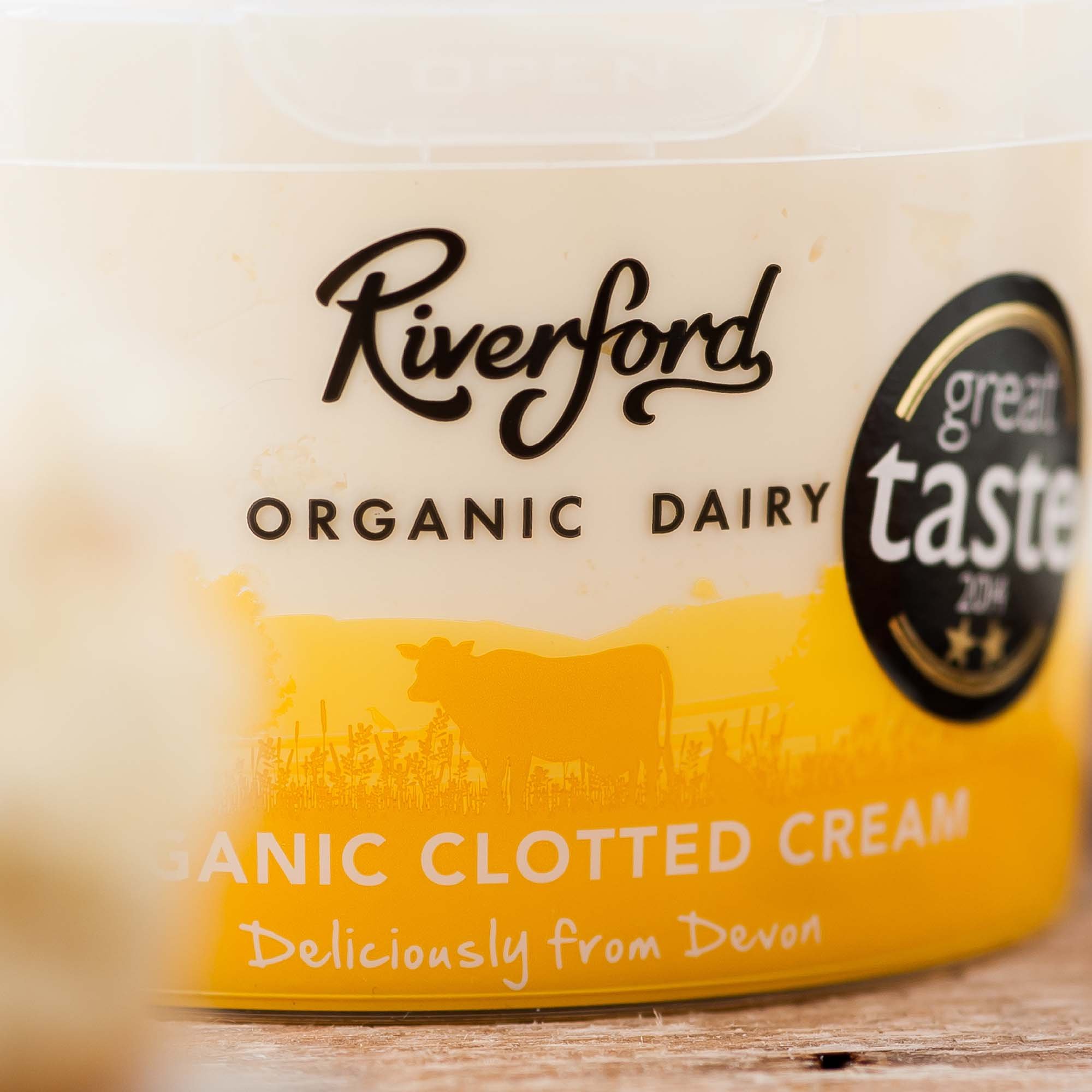
The Riverford signature is the dairy’s binding promise to their customers to continue to employ ethical farming methods and create exceptionally tasting organic products.


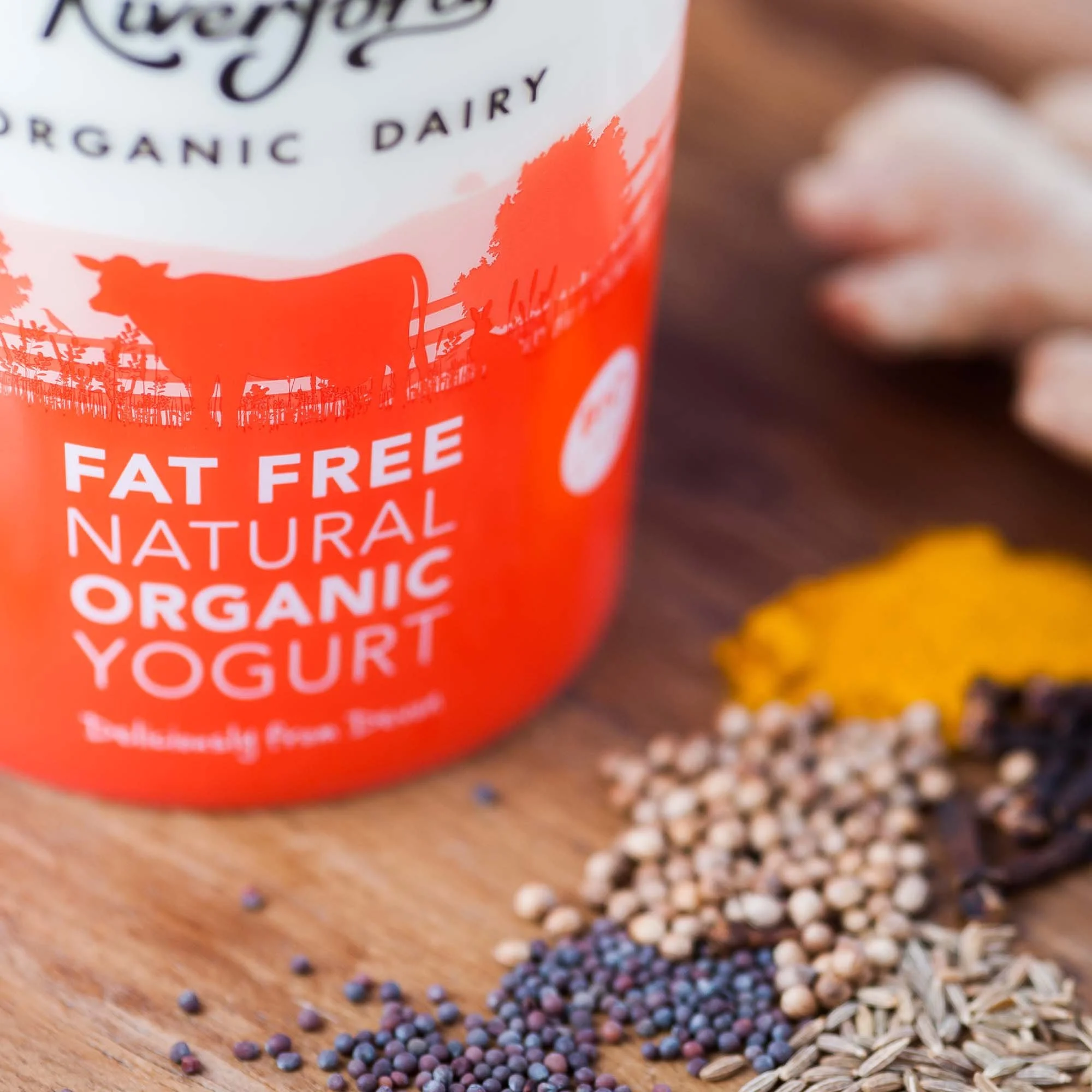
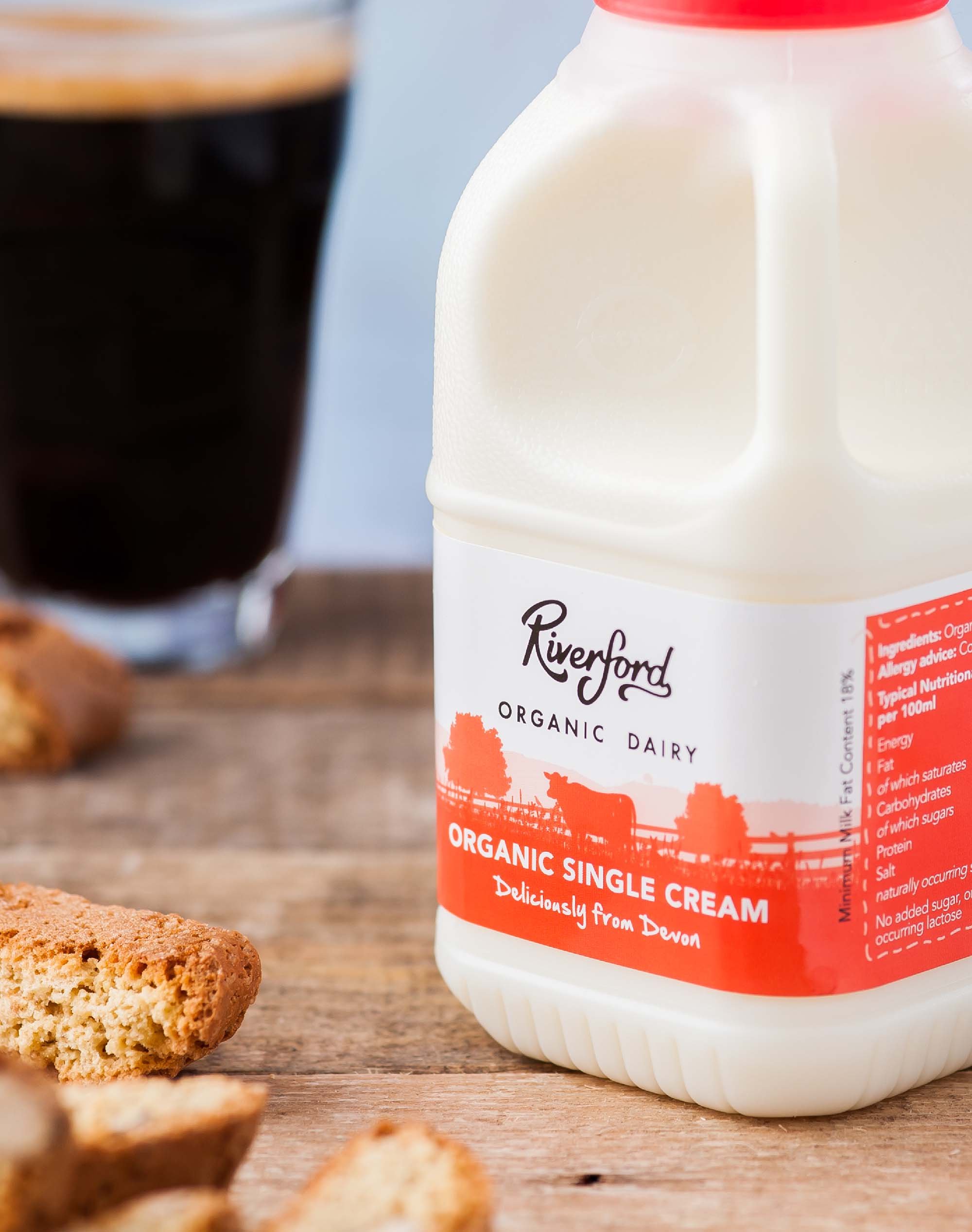
The creative motivation for the packaging was simple: to make a standout product stand out from the competition. The design heavily draws on Riverford’s natural approach to land management and animal husbandry.


Since the rebrand, Riverford Organic Dairy now supplies many well-known independent retailers, most notably Whole Foods Market and Selfridges.


We know our rebrand will sit powerfully alongside our competition, whilst clearly reflecting our unique values.
Matt has given us outstanding guidance, support and creative input, asking questions that as a business we had not considered, and have been responsive in helping us to solve unexpected obstacles during the course of a busy year which has seen us enter new markets.”
Julia Collins
Marketing & Sales Manager